Show relationship between group of activities

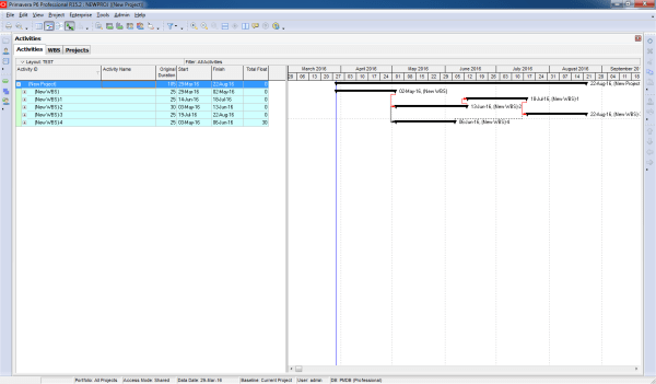
Gantt charts in Primavera P6 often display all activity relationships, which can make the report look cluttered and hard to read—especially for managers who only need a high-level view. Default View By default, Primavera shows all relationships between activities: Simplified View We want to collapse activities and show only relationships between summary bars: Instead of... Continue Reading →

Print report show predecessors in Gantt chart

When working in Primavera P6, the Relationship tab is the standard way to view the predecessors of an activity. However, identifying those activities in the schedule can be challenging. Wouldn’t it be easier if we could see them directly in the Gantt chart? Here’s how you can do it: Step 1: Collapse All Go to... Continue Reading →

Graphing a P6 Resource S-Curve in Excel

Tutorial Files Excel Spreadsheet (Excel 2007+): P6_Scurve_Example.xlsx – 1.5Mb Step 1 – Export Primavera P6 Resource Assignments to Excel Following the steps from our previous tutorial, you now have all the resources and assignments in an Excel sheet. You can modify the primary sheet for better graphical features. Step 2 – How to Use the Data To draw... Continue Reading →

Create a website or blog at WordPress.com

Up ↑