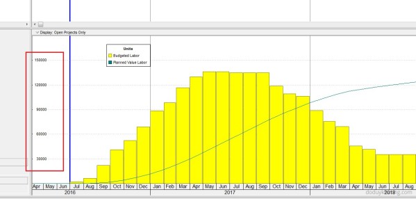
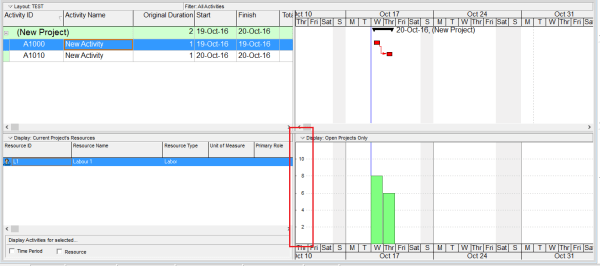
How to Print the Legend for Stacked Histogram in Resource Usage Profile in Primavera P6

When creating a stacked histogram in Primavera P6, you may notice that the legend does not appear by default in the printed report. This can make the report difficult to interpret, especially when multiple resources are displayed. For example, in the stacked histogram view (see image below), there is no visible option to include the... Continue Reading →

How is the Y-Axis scale determined in the Resource/Activity Usage Profile

When viewing the Resource Usage Profile or Activity Usage Profile in Primavera P6, you may notice that the Y-axis scale is automatically determined by the software. But how exactly is this value calculated? Let’s break it down. The Y-axis scale depends on the Timescale setting — whether it's set to week, month, or year. Based on this setting, Primavera identifies the maximum value (i.e., the tallest... Continue Reading →

Create a website or blog at WordPress.com

Up ↑