
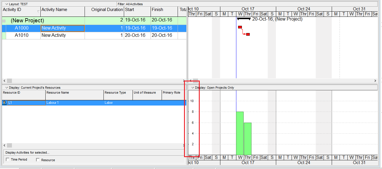
When viewing the Resource Usage Profile or Activity Usage Profile in Primavera P6, you may notice that the Y-axis scale is automatically determined by the software. But how exactly is this value calculated?
Let’s break it down.
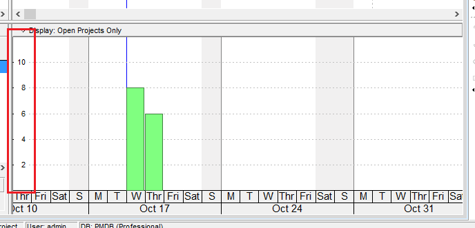
The Y-axis scale depends on the Timescale setting — whether it’s set to week, month, or year. Based on this setting, Primavera identifies the maximum value (i.e., the tallest bar) in the chart.
Let’s say we have a simple project, and the highest bar in the usage profile shows 8 hours.
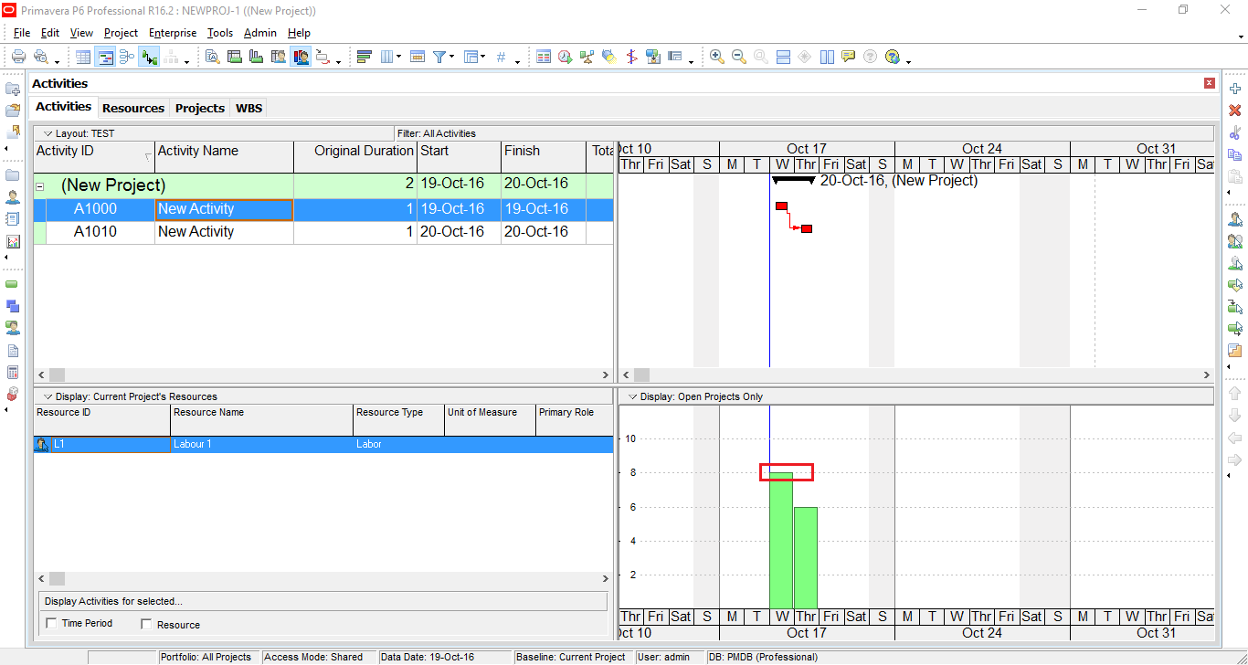
Primavera uses the following steps to determine the Y-axis scale:
- Calculate a buffer above the max value:
MaxY = Max × 1.2 = 8 × 1.2 = 9.6 hours - Divide MaxY into 6 intervals:
Interval size = 9.6 / 6 = 1.6 - Round the interval size:
- Round up the leftmost digit of the interval size.
- In this case, 1.6 rounds up to 2.
- Recalculate the MaxY using the rounded interval:
New MaxY = 2 × 6 = 12
So, the Y-axis will be labeled in intervals of 2, with a maximum value of 12.
Note:
- All calculations are done in hours, but the display may convert to days or other time units depending on your settings.
- The rounding rule is based on the leftmost digit. For example, if the calculated interval is 1200, Primavera will round it up to 2000.

Good to know. By the way, can please let us know; how to adjust cum value in the S curve adjust to 100%. Appreciate your write up on P6.
LikeLike
Hi. From my experience, it seem that P6 doesn’t support to show Y-axis in %. It only support Units or Cost
LikeLike
You can export data to Excel and change Y-axis to % complete. Kindly refer to this article https://doduykhuong.com/2016/02/04/graphing-a-p6-resource-s-curve-in-excel/
LikeLike
Thank you. I never knew how he Y axis was configured. Is Max Value influenced by the number of resources eg What is the Max Value for 6 Laborers on a Year/Quarter timescale.
LikeLike
Hi Nancy.
When you select 6 laborers, the total unit increase so the max unit will increase
LikeLike