How is the Y-Axis scale determined in the Resource/Activity Usage Profile

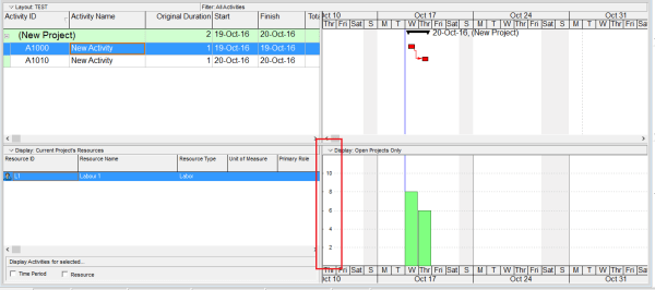
When viewing the Resource Usage Profile or Activity Usage Profile in Primavera P6, you may notice that the Y-axis scale is automatically determined by the software. But how exactly is this value calculated? Let’s break it down. The Y-axis scale depends on the Timescale setting — whether it's set to week, month, or year. Based on this setting, Primavera identifies the maximum value (i.e., the tallest... Continue Reading →

How does Progress Line in Primavera P6 work?

Primavera P6 provides a useful tool called Progress Line, which allows users to visually compare Actual Progress (% Complete) with the Baseline directly on the Gantt chart. Step-by-Step Guide 1. Project Setup We begin with a simple project that has an assigned Project Baseline. 2. Update the Project After updating the project: Activity A finishes... Continue Reading →

Renumbering Activity ID in Primavera P6

By default, Primavera P6 assigns activity IDs in a generic format like A1000, A1010, A1020, and so on. While functional, these IDs don’t provide much context. A better approach is to make IDs meaningful by including information such as the WBS they belong to. Here’s how you can do it using the Renumber Activity IDs... Continue Reading →

Show relationship between group of activities

Gantt charts in Primavera P6 often display all activity relationships, which can make the report look cluttered and hard to read—especially for managers who only need a high-level view. Default View By default, Primavera shows all relationships between activities: Simplified View We want to collapse activities and show only relationships between summary bars: Instead of... Continue Reading →

Graphing a P6 Resource S-Curve in Excel

Tutorial Files Excel Spreadsheet (Excel 2007+): P6_Scurve_Example.xlsx – 1.5Mb Step 1 – Export Primavera P6 Resource Assignments to Excel Following the steps from our previous tutorial, you now have all the resources and assignments in an Excel sheet. You can modify the primary sheet for better graphical features. Step 2 – How to Use the Data To draw... Continue Reading →

Create a website or blog at WordPress.com

Up ↑